SUNGLASS HUT

360° flagship store design

AUSTRALIA, Sydney
360° flagship store design

THE SUNGLASS HUT FLAGSHIP STORE IN SYDNEY IS THE BRAND’S LARGEST IN THE SOUTHERN HEMISPHERE.

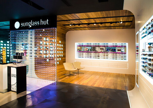
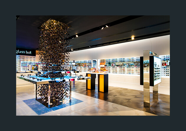
A project covering more than 300 square meters of retail space: b612 studio curated the whole project, from the concept to the realization, from the lighting design to the custom fixtures and overall customer experience design.

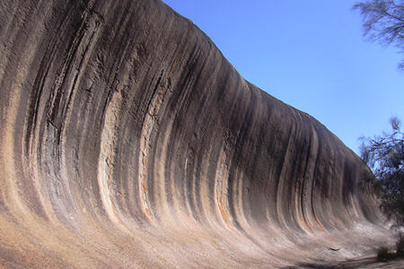
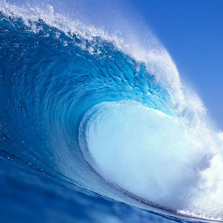
Called “The Wave,” the concept underpinning the shop’s spaces is continuity - continuity that unites floors, walls, ceilings and product displays. Most of the display units are located along the walls, thanks to built-in shelving fixtures, and are integrated with freestanding fixtures to highlight specific products.

In addition to the main retail space, the “Luxury Room” and the “Sports and Lifestyle Room” are dedicated to special brands and different ways to enjoy the shopping experience, including virtual ones.

Then, other special fixtures have been designed to emphasize certain product categories, such as the “Flying Wall,” where aviator glasses seem to hover mid-flight on a transparent surface with small led spotlights directly integrated into the glass panels.

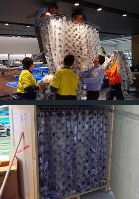
An impressive chandelier hangs in the center of the store, made with hundreds of recycled aviator lenses, designed as a tribute to Ray-Ban, celebrating its largest assortment ever.

Near this massive focal point, the store’s display system makes it possible to organize visual merchandizing in a clear, personalized way: the integrated lighting panels used as the surface of this fixture have dynamic white and RGB options in order to be able to entirely change the store’s appearance for events or product launches.
360° flagship store design

MATERIAL RESEARCH AND SELECTION MOVED IN TWO DIRECTIONS.

On the one hand, the use of innovative materials generated new types of displays.

The central visual merchandising focal point and the Flying Wall are only two examples of custom design arising from the use of new materials.

On the other hand, the choice of local materials allowed the location and local heritage define part of the store.

For example, the curved walls in the Luxury Room are made with a particular type of native Australian hardwood: spotted gum. It has then been worked to make it suitable for the luxury brands displayed in this space, while also maintaining the recognizability of the local material.


The wood used for the luxury room was selected from local species, revisiting their use and installation according to the store’s “wave” concept.

The lighting was designed to hide the fixtures as much as possible. For this reason, the lights are installed in recesses on a dark ceiling.

Our careful lighting design was united with research into new materials, achieving a flowing space and a balanced-yet-dramatic lighting layout. Light is shaped, landing on products in order to create theatrical, eye-catching light effects.
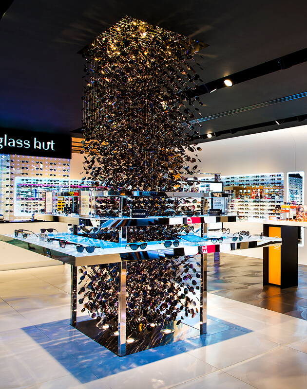
The final result is a balanced yet innovative and unique flagship store where customer experience design is the end goal. The store presents the brand and its values in a very personal way, bringing customers into a complete brand experience.

360° flagship store design

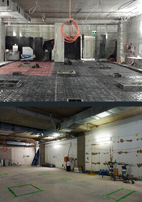
behind

the scenes

Retail space: 210 sq m / 2,260 sq ft

Chandelier: 5070 lenses

Coordinates: 33°52’13.6”S, 151°12’25.6”E
inspirations


#TheWave

360° flagship store design

#SeamlessContinuity

360° flagship store design

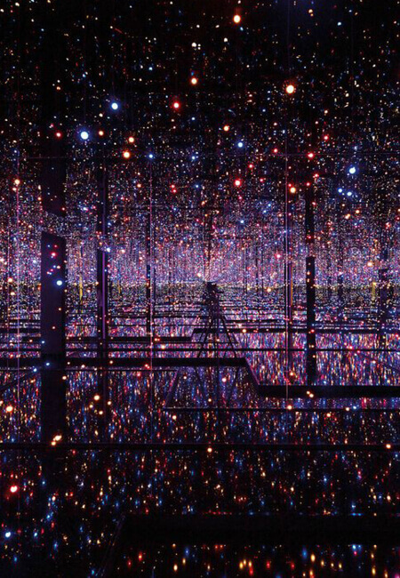
#SunglassLensesSparkles

360° flagship store design

#LocalMaterials